
Branding and publication for Advertising and Brand Design at Ravensbourne 2020
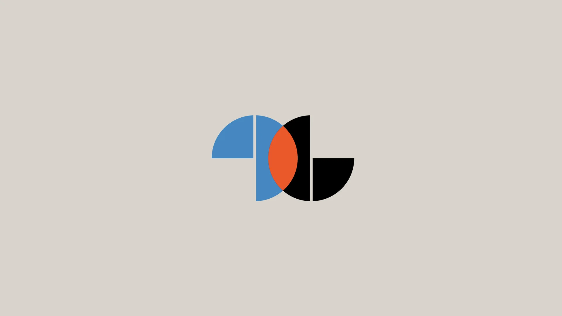
The original 906 logo concept:

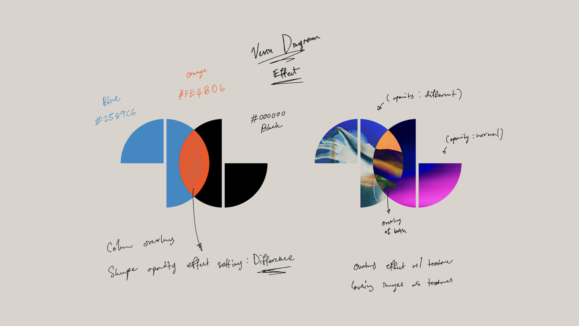
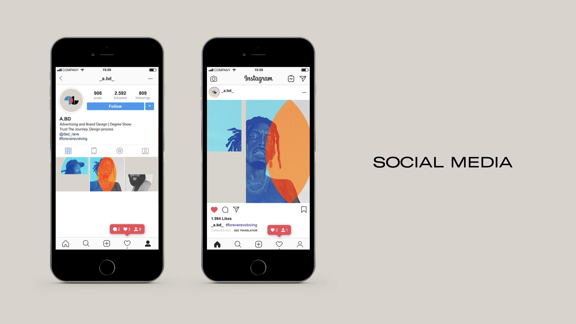
playing with how the logo could work on the cover of the publication:


When I pitched these ideas I was feeling confident in what I have created. However the class did not prefer my design. One of the main critiques I received was that people couldn’t see how this logo would show any personality of the class. I wasn’t going to take no for an answer. I continued to keep working on the logo and try to show how it could work as a design system for the course while uniquely showing each students personality.


I was excited and ready to share with the class how Ive been working to create a design system with the logo that shows the the personality of the class. However they still said it felt too clean and doesn’t represent our class. This is especially frustrating to me because the idea they were all agreeing on I felt didn’t represent me. Really the logo docent have to be the shapes that was created. It could work with other shapes. So we started working on changing the logo to show how it could work looking different.


The new shape didn’t make a difference. I was still fighting an upward battle.
new idea
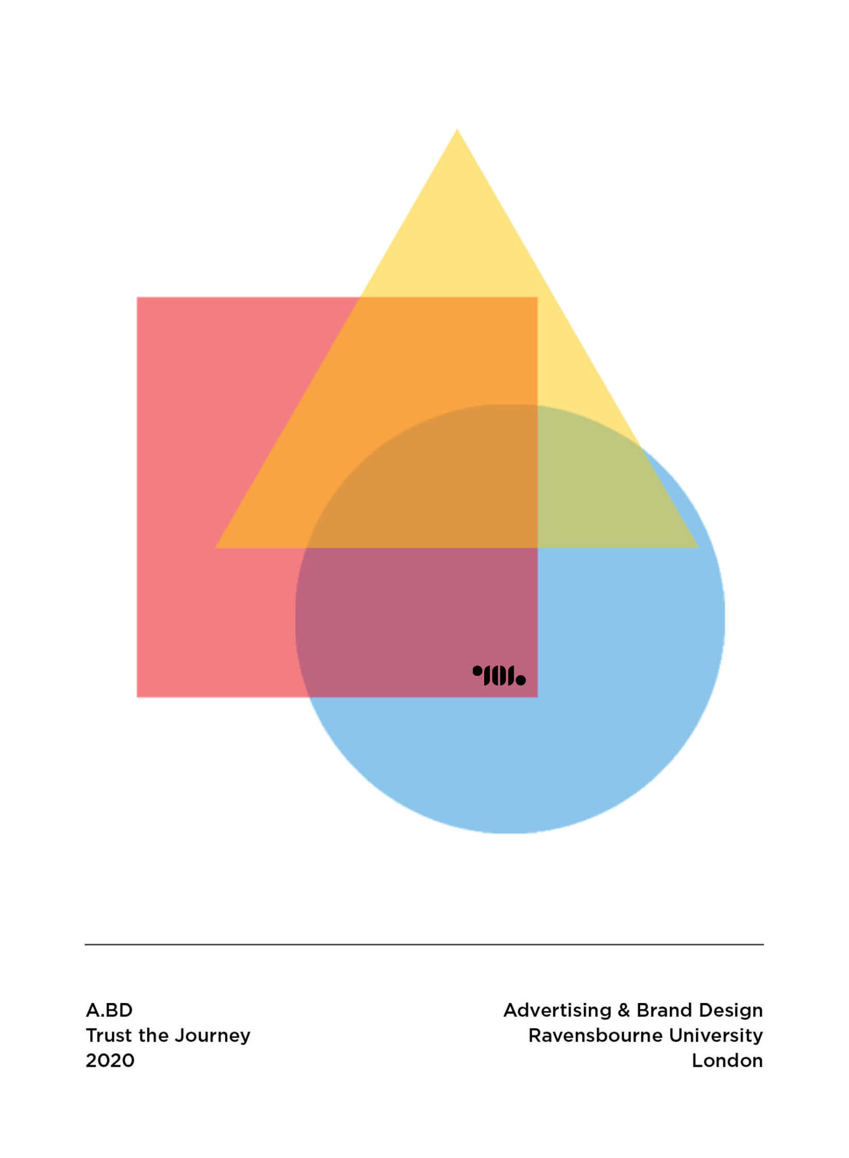
Instead of pushing this idea that the class clearly wasn’t so into it was time to start thinking about creating one last attempt. We focused on the idea that our class is like a Venn diagram. We all have different skills and together when we overlap and work together we create new and amazing ideas.


final decision
After working really hard to come up with this new idea and execute how this would look the class chose Pasiri’s and my idea. This really taught me never to give up.


